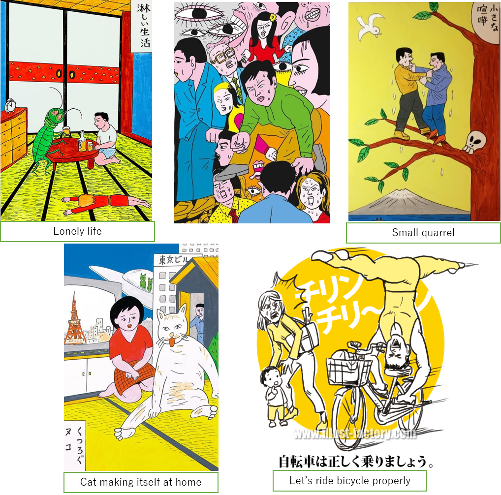
Heta Uma is a painting trend which surged rapidly in the 80s. There is no exact word in English which can translate the meaning of Heta Uma. In Japanese, this word is a collocation of two separate words “Heta” (meaning bad, not good, ugly) and “Uma” (meaning good, sophisticated, excellent). The exact origin of “Heta Uma” remains a mystery until now. There is an argument that it firstly appeared in 1980 as Japanese illustrators Teruhiko Yumura’s creation. Although the painting looks ugly and clumsy, it embraces a meaningful idea and a great sense of humor, thus it can be considered as a good illustration. Meanwhile, he criticized beautiful illustrations but convey no brilliant ideas as “Uma Heta”. Yumura’s artworks using “Heta Uma” technique became popular with a bang and they were used as the cover page for many music albums and magazines. Following famous illustrators were Yosuke Kawamura and Emiko Shimuda, to name a few.
Although “Heta Uma” painting looks technically poor (dirty color, unstable stroke, bad description) you just cannot seem to imitate its exquisite charms. “Heta Uma” includes handwritten characters and such simple illustrations that even children can draw, so it is often called childish illustration. “Heta Uma” transitioned out from small unknown exhibitions to large professional one and was displayed together with other excellent paintings. It was eventually recognized as a distinct school of art rather than a spontaneous trend. It is conceivable that professional painters always try their best to show off their dexterous skills by drawing sophisticated and meticulous paintings that cannot be easily copied. However, it is not applicable in the case of “Heta Uma”. Why was this kind of painting technique in the spotlight?

Source: plusfukuoka.com
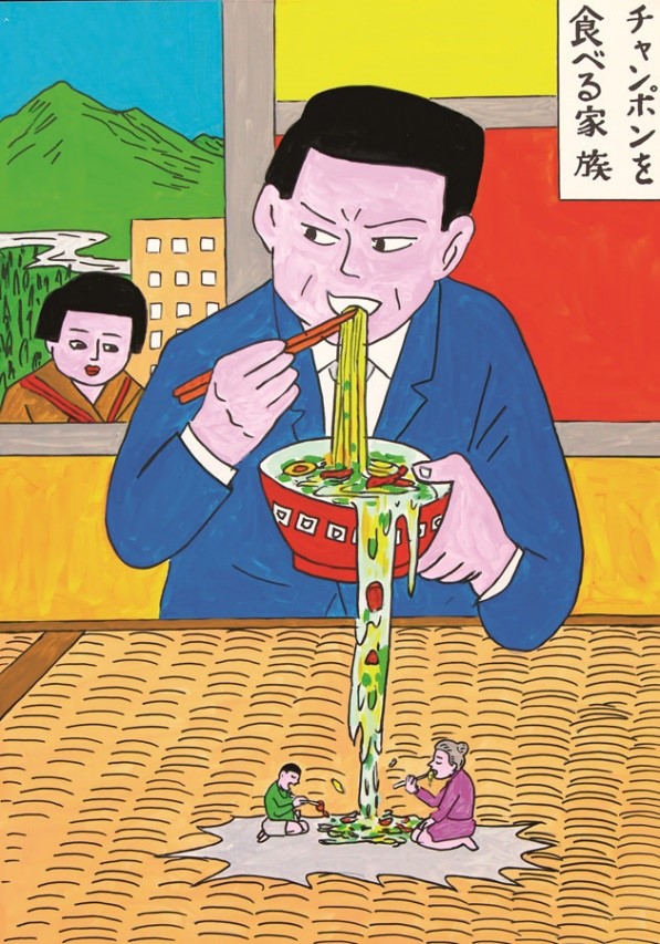
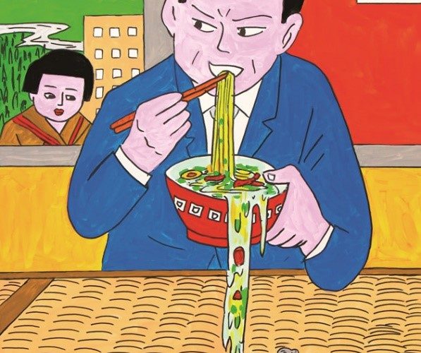
Let’s look at the following example. Have you ever encountered a teacher in your school who was always using difficult formulas and words to explain a math problem? If yes, how about a teacher who tried to use simple phrases and easy explanations to help students understand the matter? In my case, I had chances to work with both kinds of teachers and I prefer the latter one since I felt encouraged to study and challenge new things. This may be true for the case of “Heta Uma” painting. Though it looks childish, it is familiar and increase newbie painters’ incentives to work on. The easy-to-understand “Heta Uma” satisfies more people as they can grasp its meaning at the very first glance but its impression lingers in our mind for long, whereas professional art requires a lot of time to contemplate and deep rumination to comprehend. The success of a “Heta Uma” painting relies on its ability to make people laugh first then think. Let’s take a look at this painting named “Family eating Champon” drawn by famed cartoonist Yoshikazu Ebisu, who has organized several “Heta Uma” and manga exhibitions in Europe and Japan. Can you get the ironic idea in this picture?
However, not everyone can become good at “this simple childish touch”. You might feel Picasso’s paintings funny fun easy to imitate but to become a second Picasso, it is a different matter. Picasso once said “Everyone is an artist when he is a child, but the question is whether he can be an artist when he grows up.” .
Looking at children’s scrawl, I can see the genuine ideas originating from purely naïve souls. Personally, I find “Heta Uma” painting “Uma Uma”, which means that it both looks amazing and meaningful to me. It is not an easeful work to create something funny but able to convey the artist’s idea to everyone. That is why I highly appreciate “Heta Uma” artists’ infinite creation. Amazingly descriptive “Heta Uma” are used in magazines, manga and posters to attract people’s attention, especially in call-for-action posters. You are bound to encounter “Heta Uma” on trains, convenient stores, libraries, stations… which has now become a unique part of Japanese culture.


Comments